Test dimension 01
Remove categories
or move them down.
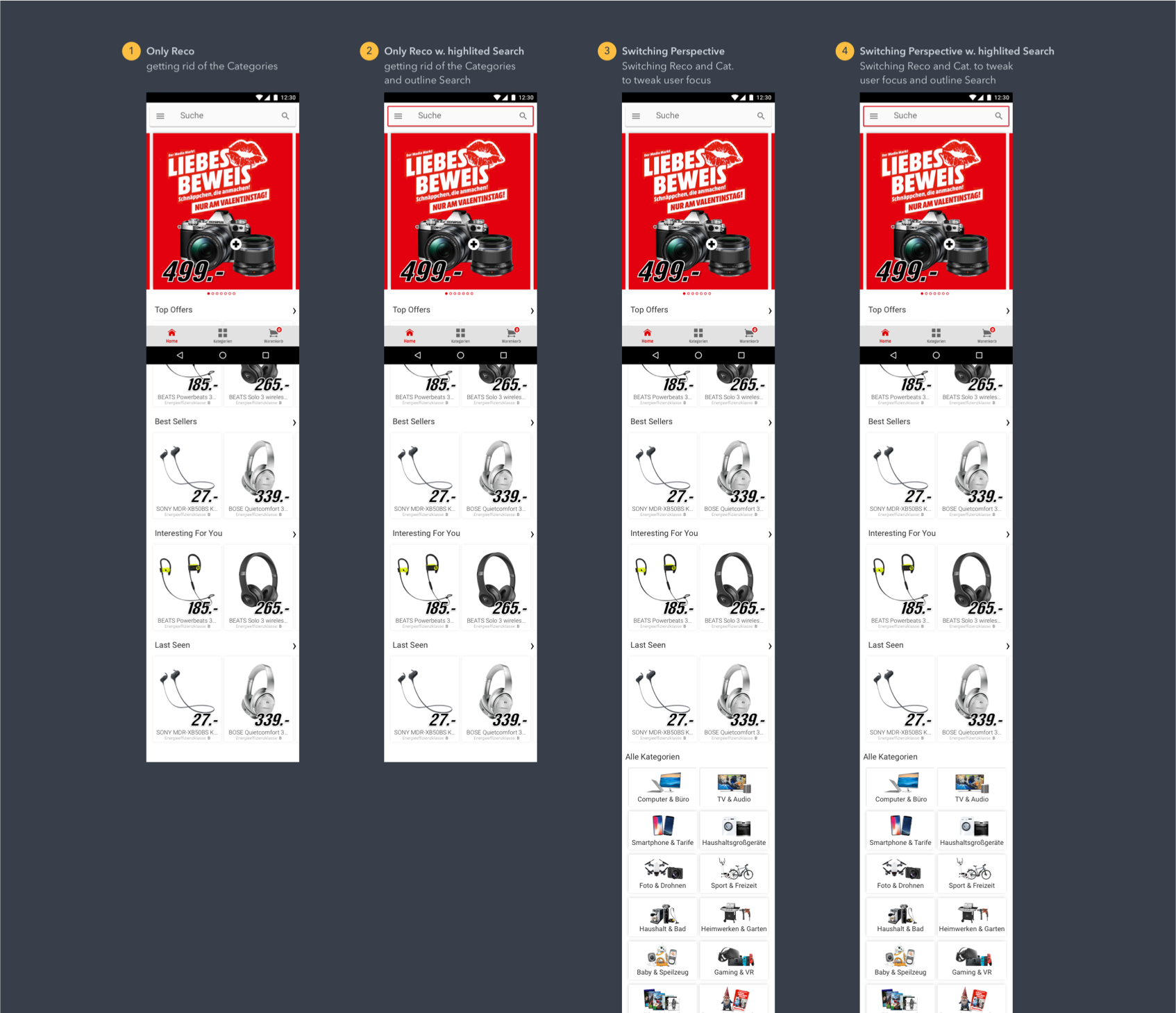
Omit the categories module or place it below product recommendations.
Higher conversion in the app-home follow-up test, followed by a redesign of the entire product search experience for the MediaMarkt and Saturn webshops.

The new app home was intended to improve access to the product range. In the first A/B test, product detail page views increased, but conversion fell compared with the original home. The new design had not yet achieved the intended result.
I worked as a freelancer within the Media Markt Saturn product team. The PO set the product focus. I developed the structure and UX concept and aligned the solution with the team. After handing the app over to a permanent designer, I was also responsible for the UX concept of the entire webshop search.
We reviewed the numbers together and considered which elements might distract users. I designed variants with and without the categories module and with more prominent search. I also took part in evaluating the follow-up test. We chose the variant together as a team.
In the follow-up test, the selected home variant achieved a higher conversion rate than the original home. I subsequently redesigned the entire webshop search experience.
01 Responsibility
Responsibility for the complete MediaMarkt and Saturn app journey.
I joined the growing Munich design team early and worked directly with the app developers. Designers owned specific product areas: I covered the app, while colleagues covered areas such as search, basket and checkout.
The Product Owner set the focus. My responsibility was the UX concept: understanding the problem from user and business perspectives, developing a viable solution, and refining it through prototypes and user feedback.
Interviews and regular usability tests were part of our product work. I brought experience from FriendScout and gutefrage to this process.
How we worked together
Focus and direction
UX concepts, user needs and product logic
Technical implementation and testing the solution
02 App home
The first A/B test showed more product views but a lower conversion rate.
The existing home displayed offers as a stack. The new home was designed to improve access to the range through more visible search, product carousels and direct category entry points. The Product Owner set the focus; I developed the structure and UX concept and aligned the solution with the team.
The first A/B test then showed more product detail page views, but less search usage and lower conversion than the old home.
We reviewed the figures together and considered which elements might distract users from finding a suitable product. The weaker result became the starting point for the next iteration.
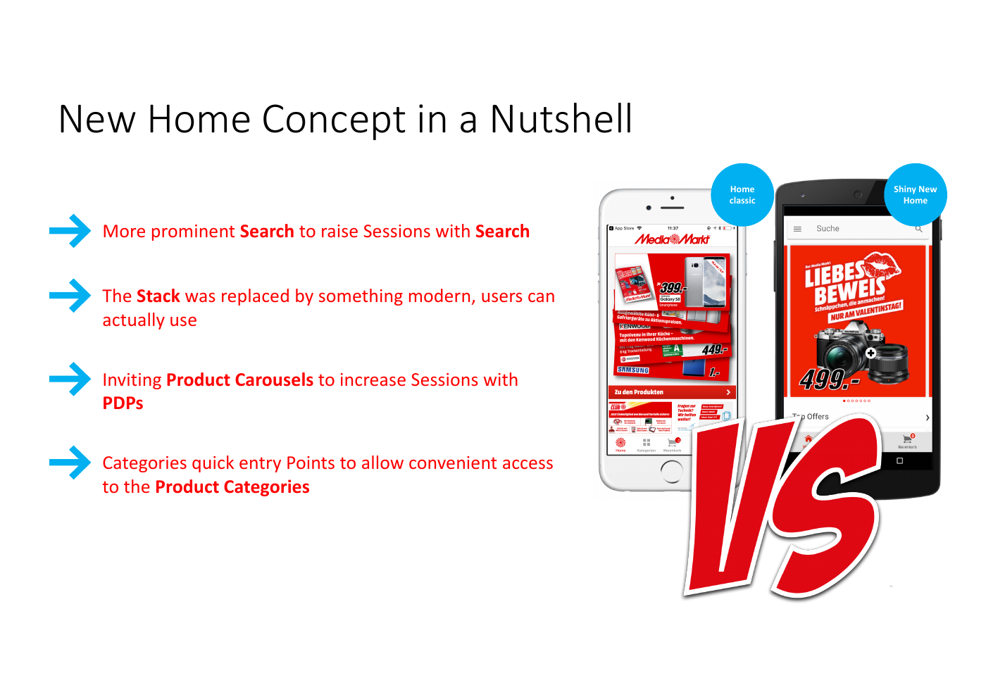
More product detail page views did not automatically mean higher conversion. We needed to revisit the entry points and the emphasis given to each home element.
03 Learning from data
We used the test findings to develop the next home iteration.
We reviewed the results as a team and formed hypotheses: was the categories module distracting people from a suitable product? Were the additional entry points generating more views but less relevant ones? What role did the visibility of free-text search play?
I translated these hypotheses into home variants with and without categories, and with more prominent search. In the variants retaining categories, I moved the module below the product recommendations. This made our hypotheses concrete enough to compare in a follow-up test.
Test dimension 01
Omit the categories module or place it below product recommendations.
Test dimension 02
Highlight the search entry point with a red border, or show it without that emphasis.
The design decision
Test categories and search
in different combinations.
The variants turned our assumptions into specific differences we could compare in the next test.
04 Testing again
In the follow-up test, variant 2 converted better than the old home.

Remove categories
Remove categories & highlight search
Move categories below recommendations
Move categories & highlight search
Documented test result
The presentation identifies variant 2 as the winner: its conversion rate exceeded the old home's in the follow-up test. Search usage remained lower. I participated in the evaluation, and we decided together which variant to adopt.
These findings describe a specific test. They do not establish long-term impact or additional claims of statistical significance.
05 Webshop search
Redesigning the entire webshop search experience, with a focus on filter interaction.
After handing over the app, I took on search for the MediaMarkt and Saturn webshops. The existing experience had become dated. I was responsible for the UX concept of the whole search experience, with particular attention to how users could operate filters and narrow their selection.
I reviewed the existing experience and usage data with the relevant colleagues. We developed hypotheses, prototypes and tests from those findings, Baymard research and our own research experience.
An example from the search redesign: filters
Grouped filters, different selection types and search within a filter group.
Active filters appear above the results. Users can remove them individually or clear the whole selection.
A two-handle slider is paired with numeric inputs and an apply button.
06 Continuity
Involvement in selection, onboarding and handover to Lora Valcheva.
I helped select the app team's permanent designer, then onboarded Lora Valcheva and handed over responsibility before moving on to webshop search.
In the growing design team, I also learned from David King, particularly about team structure, Design Operations and Design Leadership. That collaboration influenced my subsequent development.
“Great designer, very good team player with deep user understanding and strong visual skills”
What my work delivered
The app home selected by the team achieved higher conversion than the original in the follow-up test. Revised flows and prototypes were created for the entire webshop search experience, and I handed over app responsibility to a permanent designer whom I had onboarded.
I translated our analysis of the weaker initial result into testable UX variants and participated in the evaluation. Together, we selected the variant that outperformed the original home on conversion in the follow-up test.
UX concepts, research and prototypes for the entire search experience in both webshops, with a focus on filter interaction.
Participation in designer selection, onboarding and handover of app responsibility.
The home results came from team testing. For webshop search, no verified before-and-after metrics are available; the outcome is described through the design work delivered.
What I took from it
The test findings changed
our priorities for the home.
The first version of my concept produced lower conversion. With the team, I questioned the effect of individual elements and designed targeted variants. This shows how I reassess my own solutions against actual usage and translate findings into specific improvements.
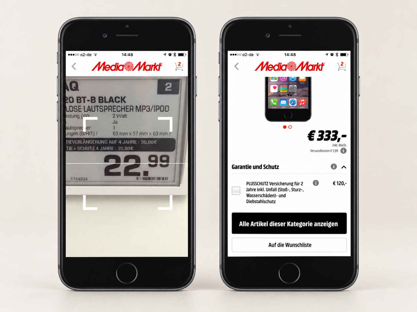
An in-store-tested Store Mode concept showed how the app could support shopping at the shelf. Customer feedback revealed obstacles to getting started and comparing products.
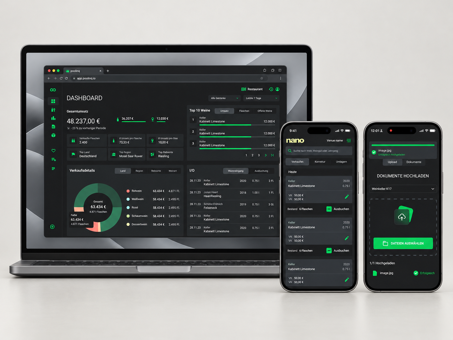
Less manual data entry when goods arrive: Drop uses AI to transfer invoice data into inventory management. Shared components provide a foundation for further product development.
An idea became a live service for choosing medical aids and finding providers. Findings from GWQ’s user tests informed navigation improvements before launch.